
本文主要和大家分享css之内边距与外边距,本文运用了多个实例与代码,希望能帮助到大家。
外边距:
margin
左边距 margin-left:数值 | autoauto:即距离这个边最远的距离
右边距: margin-right:数值 | auto上边距: margin-top:数值  这里不能用auto下边距: margin-bottom:数值 这里也不能用auto外边距 复合写法1:margin: 0px(上) 0px(右) 0px(下) 0px(左)2:margin: 0px(上) 0px(左右) 0px(下)3:margin: 0px(上下边距) 0px(左右边距)4:margin: 0px(上下左右边距都是0px)
代码示例:
<!DOCTYPE html><html lang="en"><head>
    <meta charset="UTF-8">
    <title>外边距</title>
    <link rel="stylesheet" href="index.css"/>   </head><body>
    <p class="p1">我是p1</p>
    <p class="p2">我是p2</p></body></html>p{
    width: 200px;
    height: 200px;
    background: red;
}
.p1{
    margin-left: 100px;
    margin-top: 100px;
    margin-bottom: 0px;
}
.p2{
    background: blue;
    margin-right: auto;
    margin-left: auto;
    /* margin-left: 300px;
    margin-top: -200px; */
}
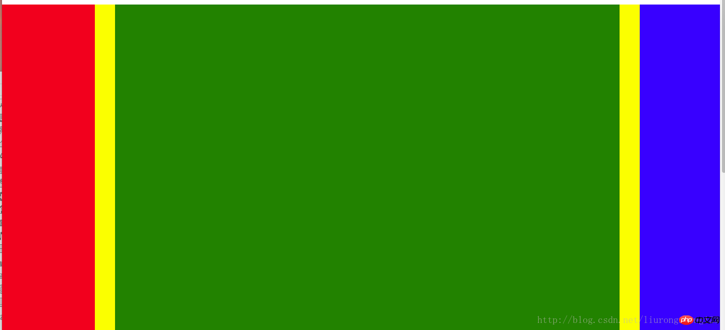
微博三列布局
模仿页面 简单实现三列<!DOCTYPE html><html lang="en"><head>
    <meta charser="utf-8"/>
    <title>微博三列布局</title>
    <style>
        .content{            width : 900px;            height : 1200px;            background-color:yellow;        }
        .p1{            width:200px;            height:1200px;            background-color:red;        }
        .p2{            width:500px;            height:1200px;            background-color:green;            margin-left:220px;            margin-top:-1200px;        }
        .p3{            width:160px;            height:1200px;            background-color:blue;            margin-left:auto;            margin-top:-1200px;        }
    </style></head><body>
    <p class="content">
        <p class="p1"></p>
        <p class="p2"></p>
        <p class="p3"></p>
    </p></body></html>
内边距
<!DOCTYPE html><html lang="en"><head>
    <meta charset="UTF-8">
    <title>内边距</title>
    <link rel="stylesheet" href="index.css"/></head><body>
    <!-- 内边距 padding -->
    <!-- 左内距 padding-left:数值 -->
    <!-- 右内距 padding-right:数值 -->
    <!-- 上内距 padding-top -->
    <!-- 下内距 padding-bottom -->

    <!-- 内边距 复合写法 -->
    <!-- 1:padding: 0px(上) 0px(右) 0px(下) 0px(左) -->
    <!-- 2:padding: 0px(上) 0px(左右) 0px(下) -->
    <!-- 3:padding: 0px(上下边距) 0px(左右边距) -->
    <!-- 4:padding: 0px (上下左右边距都是0px)-->
    <p>xxxx</p></body></html>
背景色样式:
背景样式:background
背景颜色 background-color:颜色值
背景图片 background-image:url("图片路径")
背景图片平铺 backgroud-repeat:repeat-x(沿着x轴平铺) | repeat-y(沿着Y轴平铺) | no-repeat(不平铺)
背景图片定位 background-position: x y
x轴: 支持left center right 支持百分比
y轴: 支持top center bottom 支持百分比
背景图片尺寸 background-size: x y | cover | contain
background:复合写法
background:background-color background-image background-position background-repeat定义多张图片的复合写法
background:url("timg.jpg") 0px 0px/100px 100px repeat, url("timg.jpg") 30% 30%/100px 100px no-repeat,
url("timg.jpg") 60% 60%/100px 100px no-repeat, gold url(timg.jpg) 90% 90%/100px 100px no-repeat;
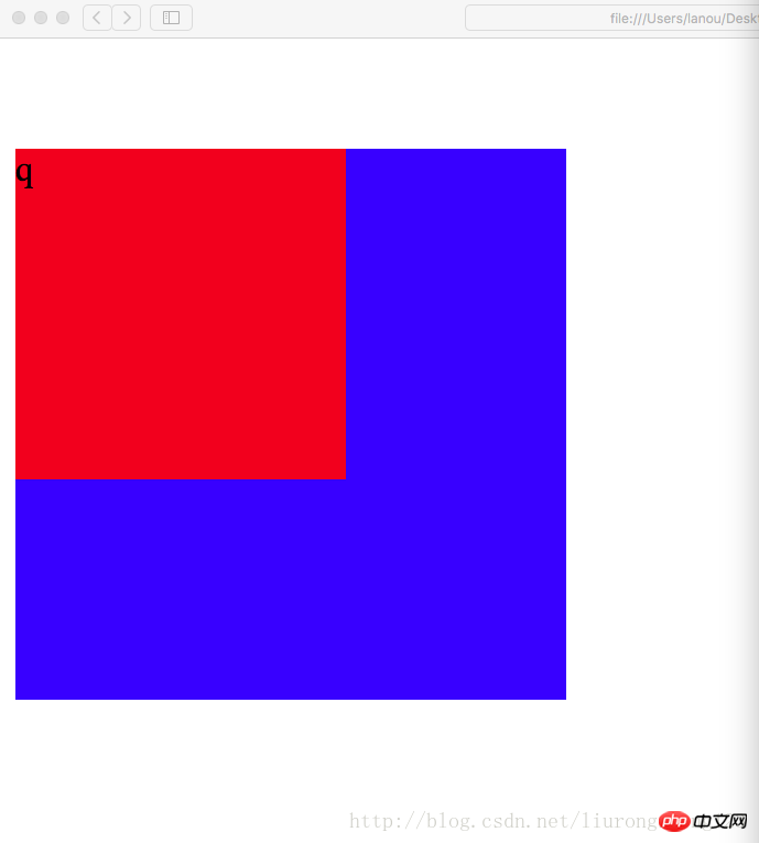
外边距的坑:
父子同级结构下,父级与子级都设置了上边距的情况下,如果父级没有设置border的情况下,会引起塌陷问题,
即父级框会向下移动一段距离(这段距离是子级设置的上边距的长度)
比如没有border的代码:
<!DOCTYPE html><html lang="en"><head>
    <meta charset="utf-8"/>
    <title>外边距的坑</title>
    <style>
        .p1{            width:250px;            height:250px;            margin-top:5px;            background-color:blue;        }
        .p2{            width:150px;            height:150px;            margin-top:50px;            background-color:red;        }
    </style></head><body>
    <p class="p1">
        <p class="p2">
            <p class="p3">q</p>
        </p>
    </p></body></html>
此时结果截图:
当设置了border时,这个塌陷问题将得到完美解决,这个塌陷问题是系统的原因,我们只负责解决
解决后的代码:
<!DOCTYPE html><html lang="en"><head>
    <meta charset="utf-8"/>
    <title>外边距的坑</title>
    <style>
        .p1{            width:250px;            height:250px;            margin-top:5px;            background-color:blue;            border:1px gold dashed;        }
        .p2{            width:150px;            height:150px;            margin-top:50px;            background-color:red;        }
    </style></head><body>
        <p class="p1">
            <p class="p2">
                <p class="p3">q</p>
            </p>
        </p></body></html>
此时运行结果截图:
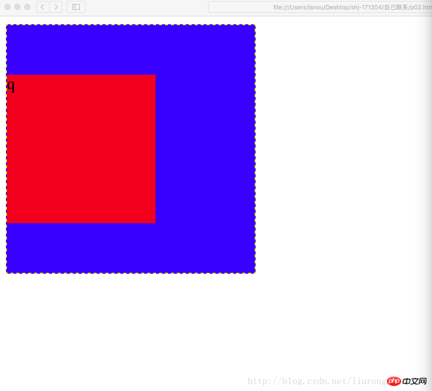
从截图中可以看到,父级的位置恢复为原来的位置(原来位置:即没有创建p2的时候,p1所在的位置),塌陷问题得到解决.
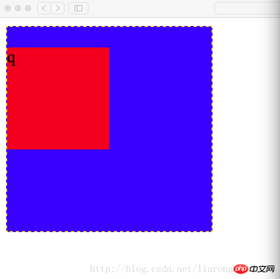
设置内边距问题
一个p即可以设置外边距也可以设置内边距,当设置内边距时,该框体会在该方向上扩大相应的距离
比如初始情况为:
<!DOCTYPE html><html lang="en"><head>
    <meta charset="utf-8"/>
    <title>外边距的坑</title>
    <style>
        .p1{            width:200px;            height:200px;            margin-top:5px;            background-color:blue;            border:1px gold dashed;        }
        .p2{            width:100px;            height:100px;            margin-top:20px;            background-color:red;        }
    </style></head><body>
        <p class="p1">
            <p class="p2">
                <p class="p3">q</p>
            </p>
        </p></body></html>
结果截图:这个结果是宽200 高200时的结果,此时没有设置内边距
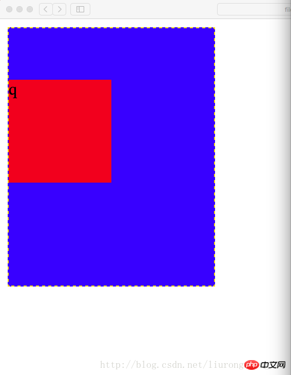
设置内边距时的代码:此时将边框顶边的内边距设置为50
代码示例:
<!DOCTYPE html><html lang="en"><head>
    <meta charset="utf-8"/>
    <title>外边距的坑</title>
    <style>
        .p1{            width:200px;            height:200px;            margin-top:5px;            padding-top:50px;            background-color:blue;            border:1px gold dashed;        }
        .p2{            width:100px;            height:100px;            margin-top:20px;            background-color:red;        }
    </style></head><body>
        <p class="p1">
            <p class="p2">
                <p class="p3">q</p>
            </p>
        </p></body></html>
结果截图:此时外边框的高变为了250,外边框顶边距内边框顶边的距离为20+50=70像素
此时要想设置内边距同时又不想改变框体的大小,需要提前从外边框的高度中减去要设置的内边距的长度,即200-50=150,即外边框的属性设置为宽200像素,高150像素
代码示例
<!DOCTYPE html><html lang="en"><head>
    <meta charset="utf-8"/>
    <title>外边距的坑</title>
    <style>
        .p1{            width:200px;            height:150px;            margin-top:5px;            padding-top:50px;            background-color:blue;            border:1px gold dashed;        }
        .p2{            width:100px;            height:100px;            margin-top:20px;            background-color:red;        }
    </style></head><body>
        <p class="p1">
            <p class="p2">
                <p class="p3">q</p>
            </p>
        </p></body></html>
结果截图:此时的结果恢复为外边框为正放形 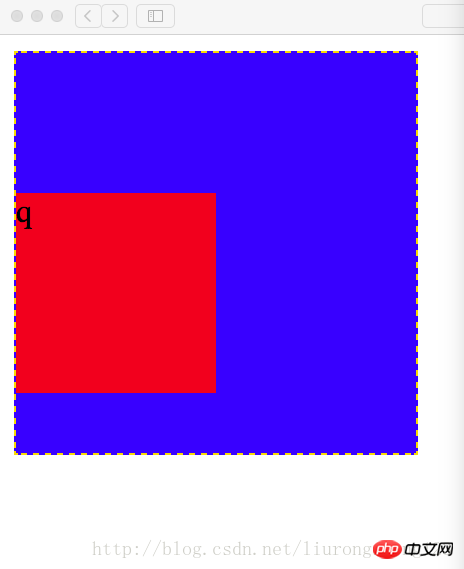
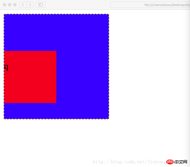
此时如果将子级的上边框也设置内边距,则也需要提前将子级的高减去相应的距离
代码示例:代码中高已经减去相应的内边距;如果子级边框不设置边框顶边的内边距,设置边框底边的内边距,此时为了确保边框不因为内边距为改变,任然需要减去相应的内边距
代码为设置边框定边的内边距
<!DOCTYPE html><html lang="en"><head>
    <meta charset="utf-8"/>
    <title>外边距的坑</title>
    <style>
        .p1{            width:200px;            height:150px;            margin-top:5px;            padding-top:50px;            background-color:blue;            border:1px gold dashed;        }
        .p2{            width:100px;            height:80px;            margin-top:20px;            padding-top:20px;            background-color:red;        }
    </style></head><body>
        <p class="p1">
            <p class="p2">
                <p class="p3">q</p>
            </p>
        </p></body></html>
结果截图:此时的结果不太明显
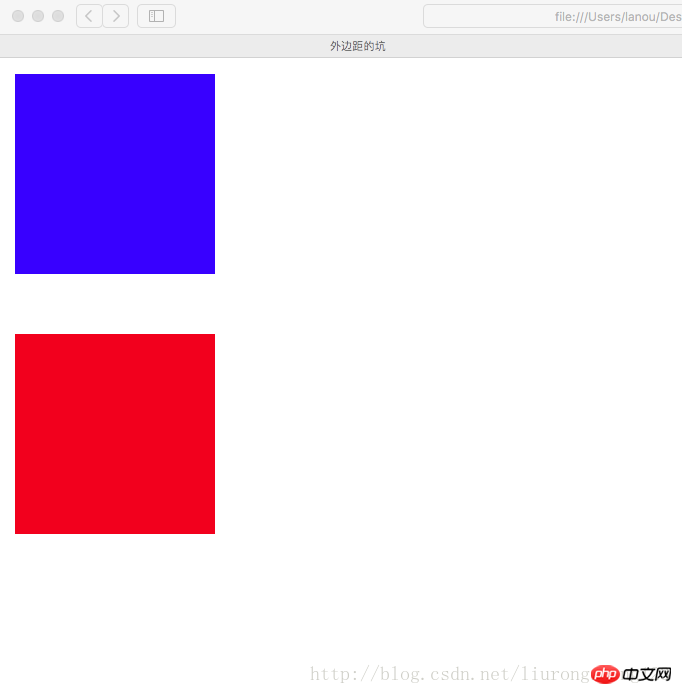
外边距的另一个坑:
同级结构下(注意不是父子结构,上面那个坑是父子级结构),外边距冲突的情况下(即两个同级的p,一个在上面,一个在下面,
你设置了外边距即magin-bottom,我也设置了外边距即(magin-top),此时两个外边距在一起会起冲突,
他们两个的距离会是两个边距中的较大者,而不是两个边距的值相加
代码示例:
<!DOCTYPE html><html lang="en"><head>
    <meta charset="utf-8"/>
    <title>外边距的坑</title>
    <style>
        .p1{            width:100px;            height:100px;            margin-bottom:20px;            background-color:blue;        }
        .p2{            width:100px;            height:100px;            margin-top:30px;            background-color:red;        }
    </style></head><body>
    <p class="p1"></p>
    <p class="p2"></p></body></html>
结果截图:
盒模型的构成需要:<!-- 盒模型:构成:容器尺寸+padding+border+margin -->
六环练习
<!DOCTYPE html><html lang="en"><head>
    <meta charset="UTF-8">
    <title>六环</title>
    <style>
        .p1{            border: 1px dashed black;            width: 600px;            height: 554px;            margin: 0 auto;            padding-top: 46px;        }
        .p2{            border: 4px lightblue solid;            background: gray;            width: 500px;            height: 475px;            margin: 0 auto;            padding-top: 25px;        }
        .p3{            background: pink;            width:450px;            height: 425px;            margin: 0 auto;            padding-top: 25px;        }
        .p4{            border: 1px dotted white;            width: 400px;            height: 380px;            margin: 0 auto;            padding-top: 20px;        }
        .p5{            border: 1px dashed white;            width: 340px;            height: 320px;            margin: 0 auto;            padding: 20px;        }
        .p6{            width:300px;            height:300px;            margin:auto;            background-color: red;        }
    </style></head><body>
    <p class="p1">
        <p class="p2">
            <p class="p3">
                <p class="p4">
                    <p class="p5">
                        <p class="p6"></p>
                    </p>
                </p>
            </p>
        </p>
    </p></body></html>
相关推荐:
使用CSS3的box-sizing属性解决div宽高被内边距撑开的问题解决方法
css margin外边距属性与用法总结
深入了解CSS外边距margin元素
以上就是CSS内边距外边距代码详解的详细内容,更多请关注css教程其它相关文章!
![[自用笔记]利用@media screen实现网页布局的自适应手机端显示导航公告背景](https://www.qieseo.com/wp-content/themes/begin/prune.php?src=https://www.qieseo.com/wp-content/uploads/2018/05/DHBJ.png&w=280&h=210&a=&zc=1)


