

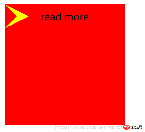
一、实现如图所示箭头
<!DOCTYPE html>
<html>
<head>
	<title></title>
<style type="text/css">
.out{
	width: 200px;
	height: 200px;
	background: #f00;
	position: relative;
}
.word{
	position: absolute;
	left: 60px;
	line-height: 40px;
}
.triangle-out{
	position: absolute;
	top: 0px;
	left: 0px;
	width: 0px;
	height: 0px;
	display: block;
	border-top: 20px solid #f00;
	border-right: 20px solid #f00;
	border-bottom: 20px solid #f00;
	border-left: 40px solid #ff0;
}
.triangle-in{
	position: absolute;
	top: 0px;
	left: 0px;
	width: 0px;
	height: 0px;
	display: block;
	border-top: 20px solid transparent;
	border-right: 20px solid transparent;
	border-bottom: 20px solid transparent;
	border-left: 20px solid #f00;
}
</style>
</head>
<body>
	<p class="out">
		<span class="triangle-out"></span>
		<span class="triangle-in"></span>
		<span class="word">read more</span>
	</p>
</body>
</html>
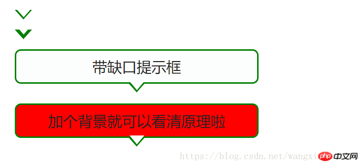
二、实现带缺口提示框
<!DOCTYPE html PUBLIC "-//W3C//DTD XHTML 1.0 Transitional//EN" "http://www.w3.org/TR/xhtml1/DTD/xhtml1-transitional.dtd">
<html xmlns="http://www.w3.org/1999/xhtml">
<head>
<meta http-equiv="Content-Type" content="text/html; charset=utf-8" />
<title>带缺口的提示框-/</title>
<style>
.wrap{
	font-size: 12px;
	margin:40px auto;
	width:600px;
}
.ui-slider-tooltip{
	background:#FCFDFD;
	border:1px solid green;
	color:#222222;
	display: block;
	text-align: center;
	padding: 5px 3px 5px 3px;
	width: 190px;
	position: relative;
}
.ui-corner-all {
	-moz-border-radius-bottomleft:5px;
	-moz-border-radius-bottomright:5px;
	-moz-border-radius-topleft:5px;
	-moz-border-radius-topright:5px;
	-webkit-border-top-left-radius:5px 5px;
	-webkit-border-top-right-radius:5px 5px;
	-webkit-border-bottom-right-radius:5px 5px;
	-webkit-border-bottom-left-radius:5px 5px;
}
.ui-tooltip-pointer-down {
	border-bottom-width: 0;
	border-left: 7px dashed transparent;
	border-right: 7px dashed transparent;
	border-top: 8px solid green;
	bottom:	-8px;
	display: block;
	height:0;
	left: 50%;
	margin-left: -7px;
	position: absolute;
	width:0;
}

.ui-tooltip-pointer-down-inner {
	border-left: 6px dashed transparent;
	border-right: 6px dashed transparent;
	border-top: 7px solid #fff;
	left: -6px;
	top: -9px;
	position: absolute;
}

.a{
	display: block;width:0;height:0;
	border-left: 7px dashed transparent;
	border-right: 7px dashed transparent;
	border-top: 8px solid green;
	border-bottom: 0;
	position: absolute;
}
.b{
	position: absolute;
	border-left: 6px dashed transparent;
	border-right: 6px dashed transparent;
	border-top: 7px solid #fff;
	top: -9px;
	left: -6px;
}
</style>
</head>
<body>
<p class="wrap">
	<h1>用CSS实现带缺口的提示框</h1>
	<span class="a">
		<span class="b"></span>
	</span>
	<br/>
	<span class="a">
		<span class="b" style="top:-11px;"></span>
	</span>
	<br/>


	<span class="ui-slider-tooltip  ui-corner-all">
		<span>带缺口提示框</span>
		<span class="ui-tooltip-pointer-down">
		<span class="ui-tooltip-pointer-down-inner" ></span>
		</span>
	</span>
	<br/>
	<span class="ui-slider-tooltip  ui-corner-all" style="background: #f00">
		<span>加个背景就可以看清原理啦</span>
		<span class="ui-tooltip-pointer-down">
		<span class="ui-tooltip-pointer-down-inner" ></span>
		</span>
	</span>
</p>
</p>
</body>
</html>
其实就是利用宽度高度为0的box,设置border,得到想要的三角形,通过三角形的叠加显示制作出箭头的效果~
本文讲解了css实现箭头和带缺口提示框 ,更多相关内容请关注前端教程。
相关推荐:
前端工程师学习基础知识
关于JavaScript基础
关于面向对象设计的相关讲解的相关讲解
以上就是css实现箭头和带缺口提示框的详细内容,更多请关注前端教程其它相关文章!


